Showing posts with label User Interface. Show all posts

Thursday, December 27, 2012

Daydream: Interactive Screen Savers

Posted by Daniel Sandler, a software engineer on the Android System UI team
Daydream


I’ve always loved screen savers. Supposedly they exist for a practical purpose: protecting that big, expensive monitor from the ghosts of spreadsheets past.


But I’ve always imagined that your computer is secretly hoping you’ll stand up and walk away for a bit. Just long enough for that idle timer to expire…so it can run off and play for a little while. Draw a picture, set off fireworks, explore the aerodynamics of kitchen appliances, whatever—while always ready to get back to work at a keystroke or nudge of the mouse.


Daydream, new in Android 4.2, brings this kind of laid-back, whimsical experience to Android phones and tablets that would otherwise be sleeping. If you haven’t checked it out, you can turn it on in the Settings app, in Display > Daydream; touch When to Daydream to enable the feature when charging.


An attract mode for apps


Apps that support Daydream can take advantage of the full Android UI toolkit in this mode, which means it’s easy to take existing components of your app — including layouts, animations, 3D, and custom views—and remix them for a more ambient presentation. And since you can use touchscreen input in this mode as well, you can provide a richly interactive experience if you choose.


Daydream provides an opportunity for your app to show off a little bit. You can choose to hide some of your app’s complexity in favor of one or more visually compelling experiences that can entertain from across a room, possibly drawing the user into your full app, like a video game’s attract mode.


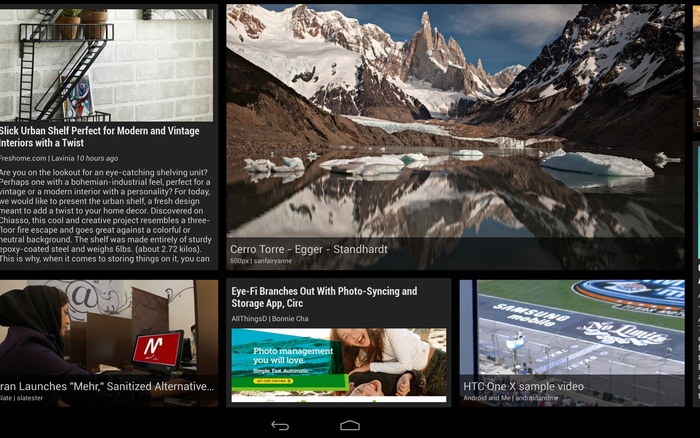
Figure 1. Google Currents scrolls stories past in a smooth, constantly-moving wall of news.


Google Currents is a great example of this approach: as a Daydream, it shows a sliding wall of visually-interesting stories selected from your editions. Touch a story, however, and Currents will show it to you full-screen; touch again to read it in the full Currents app.


The architecture of a Daydream


Each Daydream implementation is a subclass of android.service.dreams.DreamService. When you extend DreamService, you’ll have access to a simple Activity-like lifecycle API.


Key methods on DreamService to override in your subclass (don’t forget to call the superclass implementation):


Important methods on DreamService that you may want to call:


  • setContentView() — set the scene for your Daydream. Can be a layout XML resource ID or an instance of View, even a custom View you implement yourself.

  • setInteractive(boolean) — by default, your Daydream will exit if the user touches the screen, like a classic screen saver. If you want the user to be able to touch and interact with your Views, call setInteractive(true).

  • setFullscreen(boolean) — convenience method for hiding the status bar (see below).

  • setScreenBright(boolean) — by default, Daydreams keep the screen on at full brightness, which may not be appropriate for some situations (for example, dark rooms); setting this to false will reduce the display brightness to a very low level.


Finally, to advertise your Daydream to the system, create a <service> for it in your AndroidManifest.xml:


<?xml version="1.0" encoding="utf-8"?>
<manifest xmlns:android="http://schemas.android.com/apk/res/android"
package="com.example.app">
<uses-sdk android:targetSdkVersion="17" android:minSdkVersion="17" />

<application>
<service
android:name=".ExampleDaydream"
android:exported="true"
android:label="@string/my_daydream_name">
<intent-filter>
<action android:name="android.service.dreams.DreamService" />
<category android:name="android.intent.category.DEFAULT" />
</intent-filter>
<meta-data
android:name="android.service.dream"
android:resource="@xml/dream_info" />
</service>
</application>
</manifest>


The <meta-data> tag is optional; it allows you to point to an XML resource that specifies a settings Activity specific to your Daydream. The user can reach it by tapping the settings icon next to your Daydream’s name in the Settings app.


<!-- res/xml/dream_info.xml -->
<?xml version="1.0" encoding="utf-8"?>
<dream xmlns:android="http://schemas.android.com/apk/res/android"
android:settingsActivity="com.example.app/.ExampleDreamSettingsActivity" />


Here's an example to get you going: a classic screen saver, the bouncing logo, implemented using a TimeAnimator to give you buttery-smooth 60Hz animation.


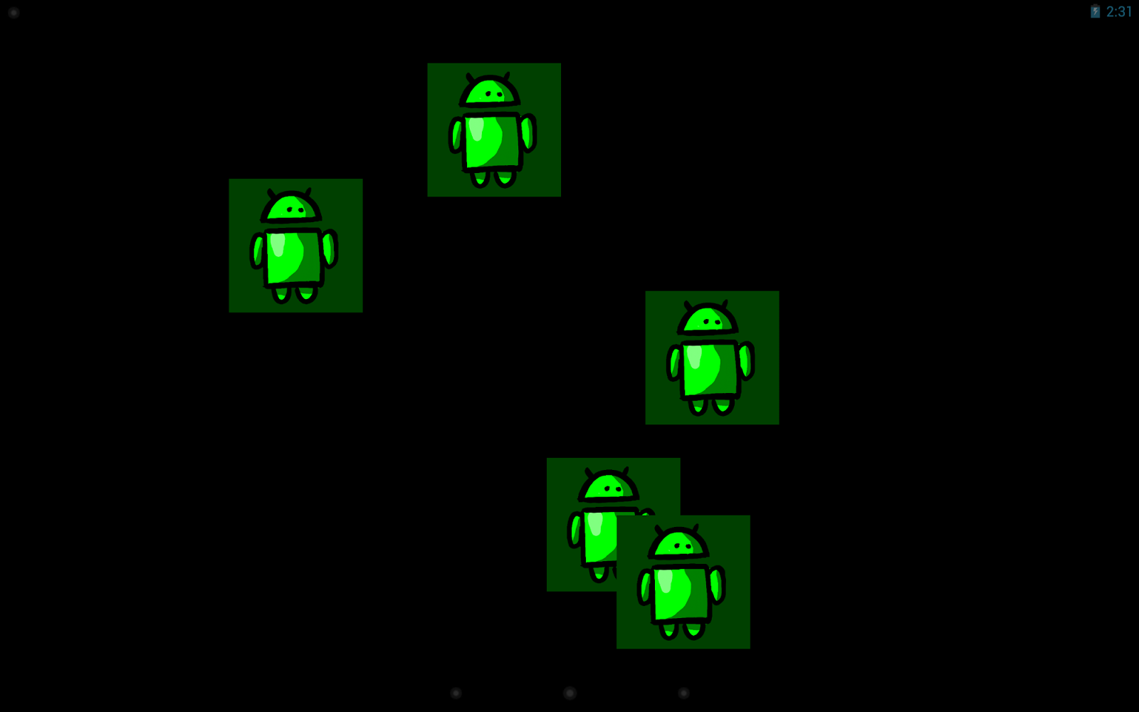
Figure 2. Will one of them hit the corner?


public class BouncerDaydream extends DreamService {
@Override
public void onDreamingStarted() {
super.onDreamingStarted();

// Our content view will take care of animating its children.
final Bouncer bouncer = new Bouncer(this);
bouncer.setLayoutParams(new
ViewGroup.LayoutParams(MATCH_PARENT, MATCH_PARENT));
bouncer.setSpeed(200); // pixels/sec

// Add some views that will be bounced around.
// Here I'm using ImageViews but they could be any kind of
// View or ViewGroup, constructed in Java or inflated from
// resources.
for (int i=0; i<5; i++) {
final FrameLayout.LayoutParams lp
= new FrameLayout.LayoutParams(WRAP_CONTENT, WRAP_CONTENT);
final ImageView image = new ImageView(this);
image.setImageResource(R.drawable.android);
image.setBackgroundColor(0xFF004000);
bouncer.addView(image, lp);
}

setContentView(bouncer);
}
}

public class Bouncer extends FrameLayout implements TimeAnimator.TimeListener {
private float mMaxSpeed;
private final TimeAnimator mAnimator;
private int mWidth, mHeight;

public Bouncer(Context context) {
this(context, null);
}

public Bouncer(Context context, AttributeSet attrs) {
this(context, attrs, 0);
}

public Bouncer(Context context, AttributeSet attrs, int flags) {
super(context, attrs, flags);
mAnimator = new TimeAnimator();
mAnimator.setTimeListener(this);
}

/**
* Start the bouncing as soon as we’re on screen.
*/
@Override
public void onAttachedToWindow() {
super.onAttachedToWindow();
mAnimator.start();
}

/**
* Stop animations when the view hierarchy is torn down.
*/
@Override
public void onDetachedFromWindow() {
mAnimator.cancel();
super.onDetachedFromWindow();
}

/**
* Whenever a view is added, place it randomly.
*/
@Override
public void addView(View v, ViewGroup.LayoutParams lp) {
super.addView(v, lp);
setupView(v);
}

/**
* Reposition all children when the container size changes.
*/
@Override
protected void onSizeChanged (int w, int h, int oldw, int oldh) {
super.onSizeChanged(w, h, oldw, oldh);
mWidth = w;
mHeight = h;
for (int i=0; i<getChildCount(); i++) {
setupView(getChildAt(i));
}
}

/**
* Bouncing view setup: random placement, random velocity.
*/
private void setupView(View v) {
final PointF p = new PointF();
final float a = (float) (Math.random()*360);
p.x = mMaxSpeed * (float)(Math.cos(a));
p.y = mMaxSpeed * (float)(Math.sin(a));
v.setTag(p);
v.setX((float) (Math.random() * (mWidth - v.getWidth())));
v.setY((float) (Math.random() * (mHeight - v.getHeight())));
}

/**
* Every TimeAnimator frame, nudge each bouncing view along.
*/
public void onTimeUpdate(TimeAnimator animation, long elapsed, long dt_ms) {
final float dt = dt_ms / 1000f; // seconds
for (int i=0; i<getChildCount(); i++) {
final View view = getChildAt(i);
final PointF v = (PointF) view.getTag();

// step view for velocity * time
view.setX(view.getX() + v.x * dt);
view.setY(view.getY() + v.y * dt);

// handle reflections
final float l = view.getX();
final float t = view.getY();
final float r = l + view.getWidth();
final float b = t + view.getHeight();
boolean flipX = false, flipY = false;
if (r > mWidth) {
view.setX(view.getX() - 2 * (r - mWidth));
flipX = true;
} else if (l < 0) {
view.setX(-l);
flipX = true;
}
if (b > mHeight) {
view.setY(view.getY() - 2 * (b - mHeight));
flipY = true;
} else if (t < 0) {
view.setY(-t);
flipY = true;
}
if (flipX) v.x *= -1;
if (flipY) v.y *= -1;
}
}

public void setSpeed(float s) {
mMaxSpeed = s;
}
}


This example code is handy for anything you want to show the user without burning it into the display (like a simple graphic or an error message), and it also makes a great starting point for more complex Daydream projects.


A few more idle thoughts


  • First, do no harm: Daydream is meant to run when a device is charging. However, if the Daydream consumes too much CPU, charging might happen very slowly or not at all! The system will stop your Daydream if it detects that the device is not charging, so make sure your code leaves enough power to charge the battery in a reasonable amount of time.

  • Respect the lockscreen: Daydream runs on top of the secure keyguard, which means that if you might be showing sensitive content, you need to give the user tools to control that content. For example, Photo Table and Photo Frame allow the user to select the albums from which photos will be displayed (avoiding embarrassing slideshows).

  • Screen brightness: Think about where you expect your Daydream to be used and adjust the screen brightness accordingly using setScreenBright() and possibly even using darker or brighter colors as necessary. A bedside clock will need to be dimmer than a desk clock; if you expect your Daydream to serve both purposes you'll need to give the user a choice.

  • To hide the status bar or not: Many users will need instant access to the battery level and time of day, so you should avoid using setFullscreen(), particularly if your Daydream is more informational than artistic. Daydream will start with the status bar in “lights out” mode (View.SYSTEM_UI_FLAG_LOW_PROFILE), where it’s quite unobtrusive but still shows the clock and charge status.

  • When to use settings: In general, you have a little latitude for adding extra knobs and dials to Daydream settings. After all, this is a personalization feature, so users should be encouraged to tweak things until they feel at home. Sometimes, though, a more compelling experience can come from taking an artistic stand: giving the user a choice from a small number of polished, beautiful configurations (rather than providing all the controls of a commercial airline cockpit).

  • There can be more than one: If you discover that your settings allow the user to pick between a few radically different display modes, consider splitting your Daydream into multiple DreamService implementations. For example, the photo gallery in Android 4.2 provides both the Photo Table and Photo Frame Daydreams.

  • Use an Activity for development: Most Android development tools are optimized for developing and debugging conventional Android apps; since DreamService and Activity are so similar, it can be useful to create a testing Activity that hosts the same content view as your DreamService. This way you can launch and test your code easily from your IDE as if it were any other Android project.


OK, that’s enough for now; you have the tools to go build Daydream support into your apps. Have fun with it — if you do, your users will have fun too. Oh, and when you upload your shiny new APK to Google Play, be sure to add a note to your app’s description so that users searching for Daydreams can discover it.


Further reading and samples


  • API docs for DreamService

  • Sample code: BouncerDaydream, complete project for the code snippets in this post

  • Sample code: WebView, a Daydream that shows an HTML page

  • Sample code: Colors, a Daydream that demonstrates OpenGL ES 2.0 and TextureView


Monday, October 8, 2012

Building Quality Tablet Apps

Posted by Reto Meier, Android Developer Relations Tech Lead


With the release of Nexus 7 earlier this year, we shared some tips on how you can get your apps ready for a new wave of Android tablets. With the holiday season now approaching, we’re creating even more ways for great tablet apps to be featured in Google Play - including a series of new app collections that highlight great apps specifically for tablet users.


To help you take advantage of the opportunity provided by the growing tablet market, we’ve put together this Tablet App Quality Checklist to make it easier for you to ensure your app meets the expectations of tablet users.


The checklist includes a number of key focus areas for building apps that are a great experience on tablets, including:

  • Optimizing your layouts for larger screens

  • Taking advantage of extra screen area available on tablets

  • Using Icons and other assets that are designed for tablet screens


Each focus area comprises several smaller tasks or best practices. As you move through the checklist, you'll find links to support resources that can help you address the topics raised in each task.


The benefits of building an app that works great on tablets is evident in the experiences of Mint.com, Tiny Co, and Instapaper who reported increased user engagement, better monetization, and more downloads from tablet users. You can find out more about their experience in these developer case studies.


The Tablet Quality Checklist is a great place to get started, but it’s just the beginning. We’ll be sharing more tablet development tips every day this week on +Android Developers. In Android Developers Live, Tuesday’s Android Design in Action broadcast will focus on optimizing user experience for tablets, on Thursday we’ll be interviewing our tablet case studies during Developers Strike Back, and on Friday’s live YouTube broadcasts of The App Clinic and Friday Games Review will be reviewing apps and games on Android tablets.


What are your best tips for building great

tablet apps?


Join the discussion on

+Android Developers


Tuesday, April 10, 2012

Accessibility: Are You Serving All Your Users?

[This post is by Joe Fernandez, a technical writer for developer.android.com who cares about accessibility and usability. — Tim Bray.]

We recently published some new resources to help developers make their Android applications more accessible:

“But,” you may be thinking, “What is accessibility, exactly? Why should I make it a priority? How do I do it? And most importantly, how do I spell it?” All good questions. Let’s hit some of the key points.


Accessibility is about making sure that Android users who have limited vision or other physical impairments can use your application just as well as all those folks in line at the supermarket checking email on their phones.
It’s also about the Mom over in the produce section whose kids are driving her to distraction, and really needs to see that critical notification your application is trying to deliver. It’s also about you, in the future; Is your eyesight getting better over time? How about that hand-eye coordination?

When it comes down to it, making an application accessible is about having a deep commitment to usability, getting the details right and delighting your users. It also means stepping into new territory and getting a different perspective on your application. Try it out: Open up an application you developed (or your all-time favorite app), then close your eyes and try to complete a task. No peeking! A little challenging, right?

How Android Enables Accessibility

One of main ways that Android enables accessibility is by allowing users to hear spoken feedback that announces the content of user interface components as they interact with applications. This spoken feedback is provided by an accessibility service called TalkBack, which is available for free on Google Play and has become a standard component of recent Android releases.

Now enable TalkBack, and try that eyes-closed experiment again. Being able to hear your application’s interface probably makes this experiment a little easier, but it’s still challenging. This type of interaction is how many folks with limited vision use their Android devices every day. The spoken feedback works because all the user interface components provided by the Android framework are built so they can provide descriptions of themselves to accessibility services like TalkBack.

Another key element of accessibility on Android devices is the ability to use alternative navigation. Many users prefer directional controllers such as D-pads, trackballs or keyboard arrows because it allows them to make discrete, predictable movements through a user interface. You can try out directional control with your apps using the virtual keyboard in the Android emulator or by installing and enabling the Eyes-Free Keyboard on your device. Android enables this type of navigation by default, but you, as a developer, may need to take a few steps to make sure users can effectively navigate your app this way.

How to Make Your Application Accessible

It would be great to be able to give you a standard recipe for accessibility, but the truth of the matter is that the right answer depends on the design and functionality of your application. Here are some key steps for ensuring that your application is accessible:

  1. Task flows: Design well-defined, clear task flows with minimal navigation steps, especially for major user tasks, and make sure those tasks are navigable via focus controls (see item 4).


  2. Action target size: Make sure buttons and selectable areas are of sufficient size for users to easily touch them, especially for critical actions. How big? We recommend that touch targets be 48dp (roughly 9mm) or larger.

  3. Label user interface controls: Label user interface components that do not have visible text, especially ImageButton, ImageView, and EditText components. Use the android:contentDescription XML layout attribute or setContentDescription() to provide this information for accessibility services.


  4. Enable focus-based navigation: Make sure users can navigate your screen layouts using hardware-based or software directional controls (D-pads, trackballs and keyboards). In a few cases, you may need to make UI components focusable or change the focus order to be more logical.


  5. Use framework-provided controls: Use Android's built-in user interface controls whenever possible, as these components provide accessibility support by default.


  6. Custom view controls: If you build custom interface controls for your application, implement accessibility interfaces for your custom views and provide text labels for the controls.


  7. Test: Checking off the items on this list doesn’t guarantee your app is accessible. Test accessibility by attempting to navigate your application using directional controls, and also try eyes free navigation with the TalkBack service enabled.


Here’s an example of implementing some basic accessibility features for an ImageButton inside an XML layout:

<ImageButton
android:id="@+id/add_note_button"
android:src="@drawable/add_note_image"
android:contentDescription="@string/add_note_description"/>

Notice that we’ve added a content description that accessibility services can use to provide an audible explanation of the button. Users can navigate to this button and activate it with directional controls, because ImageButton objects are focusable by default (so you don’t have to include the android:focusable="true" attribute).

The good news is that, in most cases, implementing accessibility isn’t about radically restructuring your application, but rather working through the subtle details of accessibility. Making sure your application is accessible is an opportunity to look at your app from a different perspective, improve the overall quality of your app and ensure that all your users have a great experience.

Wednesday, February 29, 2012

Android Design V2: Now with stencils

[This post is by Android designer Alex Faaborg, on behalf of the entire User Experience team. —Tim Bray]

When we initially released Android Design, by far the number one request we received was for us to release stencils as well. The fine folks on the Android User Experience team are pleased today to release some official Android Design stencils for your mockup-creating pleasure.

With these stencils you can now drag and drop your way to beautifully designed Ice Cream Sandwich (Android 4.0) applications, with grace and ease. The stencils feature the rich typography, colors, interactive controls, and icons found throughout Ice Cream Sandwich, along with some phone and tablet outlines to frame your meticulously crafted creations.

Currently we have stencils available for those venerable interactive design powerhouses Adobe® Fireworks®, and Omni® OmniGraffle® and we may expand to other applications® in the future. The source files for the various icons and controls are also available, created in Adobe® Photoshop®, and Adobe® Illustrator®. Here are the downloads.

We’ll be updating these stencils over time so, as always, please send in your feedback!

Happy mockup making,

— Your friendly Android Design Droids

Thursday, January 26, 2012

Say Goodbye to the Menu Button

[This post is by Scott Main, lead tech writer for developer.android.com. — Tim Bray]

Before Android 3.0 (Honeycomb), all Android-powered devices included a dedicated Menu button. As a developer, you could use the Menu button to display whatever options were relevant to the user, often using the activity’s built-in options menu. Honeycomb removed the reliance on physical buttons, and introduced the ActionBar class as the standard solution to make actions from the user options immediately visible and quick to invoke. In order to provide the most intuitive and consistent user experience in your apps, you should migrate your designs away from using the Menu button and toward using the action bar. This isn’t a new concept — the action bar pattern has been around on Android even before Honeycomb. As Ice Cream Sandwich rolls out to more devices, it’s important that you begin to migrate your designs to the action bar in order to promote a consistent Android user experience.

You might worry that it’s too much work to begin using the action bar, because you need to support versions of Android older than Honeycomb. However, it’s quite simple for most apps because you can continue to support the Menu button on pre-Honeycomb devices, but also provide the action bar on newer devices with only a few lines of code changes.

If I had to put this whole post into one sentence, it’d be: Set targetSdkVersion to 14 and, if you use the options menu, surface a few actions in the action bar with showAsAction="ifRoom".

Don’t call it a menu

Not only should your apps stop relying on the hardware Menu button, but you should stop thinking about your activities using a “menu button” at all. Your activities should provide buttons for important user actions directly in the action bar (or elsewhere on screen). Those that can’t fit in the action bar end up in the action overflow.

In the screenshot here, you can see an action button for Search and the action overflow on the right side of the action bar.

Even if your app is built to support versions of Android older than 3.0 (in which apps traditionally use the options menu panel to display user options/actions), when it runs on Android 3.0 and beyond, there’s no Menu button. The button that appears in the system/navigation bar represents the action overflow for legacy apps, which reveals actions and user options that have “overflowed off the screen.”

This might seem like splitting hairs over terminology, but the name action overflow promotes a different way of thinking. Instead of thinking about a menu that serves as a catch-all for various user options, you should think more about which user options you want to display on the screen as actions. Those that don't need to be on the screen can overflow off the screen. Users can reveal the overflow and other options by touching an overflow button that appears alongside the on-screen action buttons.

Action overflow button for legacy apps

If you’ve already developed an app to support Android 2.3 and lower, then you might have noticed that when it runs on a device without a hardware Menu button (such as a Honeycomb tablet or Galaxy Nexus), the system adds the action overflow button beside the system navigation.

This is a compatibility behavior for legacy apps designed to ensure that apps built to expect a Menu button remain functional. However, this button doesn’t provide an ideal user experience. In fact, in apps that don’t use an options menu anyway, this action overflow button does nothing and creates user confusion. So you should update your legacy apps to remove the action overflow from the navigation bar when running on Android 3.0+ and begin using the action bar if necessary. You can do so all while remaining backward compatible with the devices your apps currently support.

If your app runs on a device without a dedicated Menu button, the system decides whether to add the action overflow to the navigation bar based on which API levels you declare to support in the <uses-sdk> manifest element. The logic boils down to:

  • If you set either minSdkVersion or targetSdkVersion to 11 or higher, the system will not add the legacy overflow button.


  • Otherwise, the system will add the legacy overflow button when running on Android 3.0 or higher.


  • The only exception is that if you set minSdkVersion to 10 or lower, set targetSdkVersion to 11, 12, or 13, and you do not use ActionBar, the system will add the legacy overflow button when running your app on a handset with Android 4.0 or higher.


That exception might be a bit confusing, but it’s based on the belief that if you designed your app to support pre-Honeycomb handsets and Honeycomb tablets, it probably expects handset devices to include a Menu button (but it supports tablets that don’t have one).

So, to ensure that the overflow action button never appears beside the system navigation, you should set the targetSdkVersion to 14. (You can leave minSdkVersion at something much lower to continue supporting older devices.)

Migrating to the action bar

If you have activities that use the options menu (they implement onCreateOptionsMenu()), then once the legacy overflow button disappears from the system/navigation bar (because you’ve set targetSdkVersion to 14), you need to provide an alternative means for the user to access the activity’s actions and other options. Fortunately, the system provides such a means by default: the action bar.

Add showAsAction="ifRoom" to the <item> elements representing the activity’s most important actions to show them in the action bar when space is available. For help deciding how to prioritize which actions should appear in the action bar, see Android Design’s Action Bar guide.

To further provide a consistent user experience in the action bar, we suggest that you use action icons designed by the Android UX Team where appropriate. The available icons support common user actions such as Refresh, Delete, Attach, Star, Share and more, and are designed for the light and dark Holo themes; they’re available on the Android Design downloads page.

If these icons don’t accommodate your needs and you need to create your own, you should follow the Iconography design guide.

Removing the action bar

If you don’t need the action bar, you can remove it from your entire app or from individual activities. This is appropriate for apps that never used the options menu or for apps in which the action bar doesn’t meet design needs (such as games). You can remove the action bar using a theme such as Theme.Holo.NoActionBar or Theme.DeviceDefault.NoActionBar.

In order to use such a theme and remain backward compatible, you can use Android’s resource system to define different themes for different platform versions, as described by Adam Powell’s post, Holo Everywhere. All you need is your own theme, which you define to inherit different platform themes depending on the current platform version.

For example, here’s how you can declare a custom theme for your application:

<application android:theme="@style/NoActionBar">

Or you can instead declare the theme for individual <activity> elements.

For pre-Honeycomb devices, include the following theme in res/values/themes.xml that inherits the standard platform theme:

<resources>
<style name="NoActionBar" parent="@android:style/Theme">
<!-- Inherits the default theme for pre-HC (no action bar) -->
</style>
</resources>

For Honeycomb and beyond, include the following theme in res/values-v11/themes.xml that inherits a NoActionBar theme:

<resources>
<style name="NoActionBar" parent="@android:style/Theme.Holo.NoActionBar">
<!-- Inherits the Holo theme with no action bar; no other styles needed. -->
</style>
</resources>

At runtime, the system applies the appropriate version of the NoActionBar theme based on the system’s API version.

Summary

  • Android no longer requires a dedicated Menu button, some devices don’t have one, and you should migrate away from using it.


  • Set targetSdkVersion to 14, then test your app on Android 4.0.


  • Add showAsAction="ifRoom" to menu items you’d like to surface in the action bar.


  • If the ActionBar doesn’t work for your app, you can remove it with Theme.Holo.NoActionBar or Theme.DeviceDefault.NoActionBar.

For information about how you should design your action bar, see Android Design’s Action Bar guide. More information about implementing the action bar is also available in the Action Bar developer guide.

Thursday, January 12, 2012

Introducing the Android Design site

[This post is by Christian Robertson, who leads the Android visual design group. He is also the designer of the Roboto font family. —Tim Bray]

Ice Cream Sandwich (Android 4.0) is our biggest redesign yet — both for users and developers. We’ve enhanced the UI framework with new interactions and styles that will let you create Android apps that are simpler and more beautiful than ever before.


To help you use great UI in your apps, we’re introducing Android Design: the place to learn about principles, building blocks, and patterns for creating world-class Android user interfaces.
Whether you’re a UI professional or a developer playing that role, these docs show you how to make good design decisions, big and small.

The Android User Experience Team is committed to helping you design amazing apps that people love, and this is just the beginning. In the coming months, we’ll expand Android Design with more in-depth content. And watch this blog for a series of posts about design, and invitations to Google+ hangouts on the topics you care about most.

So head on over to Android Design, and make something amazing!

Tuesday, January 3, 2012

Holo Everywhere

[This post is by Adam Powell, an Android Framework engineer who cares about style. —Tim Bray]

Android 4.0 showcases the Holo theme family, further refined since its debut in Android 3.0. But as most developers know, a new system theme for some Android devices isn’t a new or uncommon event. For developers new system themes mean more design targets for their apps. Using system themes means developers can take advantage of a user’s existing expectations and it can save a lot of production time, but only if an app designer can reliably predict the results. Before Android 4.0 the variance in system themes from device to device could make it difficult to design an app with a single predictable look and feel. We set out to improve this situation for the developer community in Ice Cream Sandwich and beyond.


Theme.Holo
If you’re not already familiar with Android’s style and theme system, you should read Styles and Themes before continuing.

Compatibility Standard

In Android 4.0, Holo is different. We’ve made the inclusion of the unmodified Holo theme family a compatibility requirement for devices running Android 4.0 and forward. If the device has Android Market it will have the Holo themes as they were originally designed.

This standardization goes for all of the public Holo widget styles as well. The Widget.Holo styles will be stable from device to device, safe for use as parent styles for incremental customizations within your app.

The Holo theme family in Android 4.0 consists of the themes Theme.Holo, Theme.Holo.Light, and Theme.Holo.Light.DarkActionBar. Examples of these themes in action are shown in the screenshots lining this post.

To use a Holo theme, explicitly request one from your manifest on your activity or application element, e.g. android:theme="@android:style/Theme.Holo". Your app will be displayed using the unmodified theme on all compatible Android 4.0 devices. The Holo themes may also be used as stable parent themes for app-level theme customizations.

What about device themes?

We have no desire to restrict manufacturers from building their own themed experience across their devices. In fact we’ve gone further to make this even easier. In Android 4.0’s API (level 14) we’ve added a new public theme family to complement the Holo family introduced in Android 3.0: DeviceDefault. DeviceDefault themes are aliases for the device’s native look and feel. The DeviceDefault theme family and widget style family offer ways for developers to target the device’s native theme with all customizations intact.


Theme.Holo.Light
Formally separating these theme families will also make future merges easier for manufacturers updating to a new platform version, helping more devices update more quickly. Google’s Nexus devices alias DeviceDefault to the unmodified Holo themes.

Making use of your chosen theme

We’ve added a number of theme attributes to report common metrics and color palette info to apps that want to fit in with a theme. These include highlight colors, default padding and margins for common UI elements such as list items, and more. Apps that wish to integrate with their chosen theme (both Holo and DeviceDefault included) can refer to these theme attributes as in the examples below:

Sample button with system-supplied touch highlight:

<ImageButton android:id="@+id/my_button"
android:layout_width="wrap_content"
android:layout_height="wrap_content"
android:src="@drawable/button_icon"
android:background="?android:attr/selectableItemBackground" />
Sample widget with a custom pressedHighlightColor attribute, value retrieved from the system theme:

<MyWidget android:layout_width="wrap_content"
android:layout_height="wrap_content"
myapp:pressedHighlightColor="?android:attr/colorPressedHighlight" />
Sample list item layout using system-supplied metrics and text appearance:

<LinearLayout android:layout_width="match_parent"
android:layout_height="?android:attr/listPreferredItemHeight"
android:paddingLeft="?android:attr/listPreferredItemPaddingLeft"
android:paddingRight="?android:attr/listPreferredItemPaddingRight">
<TextView android:id="@+id/text"
android:textAppearance="?android:attr/textAppearanceListItem" />
<!-- Other views here -->
</LinearLayout>


Theme.Holo.Light.DarkActionBar

(Available in API level 14 and above)

Defaults for Older Apps

If an app does not explicitly request a theme in its manifest, Android 4.0 will determine the default theme based on the app’s targetSdkVersion to maintain the app’s original expectations: For values less than 11, @android:style/Theme; between 11 and 13 @android:style/Theme.Holo; and for 14 and higher @android:style/Theme.DeviceDefault.

Using Holo while supporting Android 2.x

Most Android developers will still want to support 2.x devices for a while as updates and new devices continue to roll out. This doesn’t stop you from taking advantage of newer themes on devices that support them though. Using Android’s resource system you can define themes for your app that are selected automatically based on the platform version of the device it’s running on.

Theme.Holo and Theme.Holo.Light have been available since API level 11, but Theme.Holo.Light.DarkActionBar is new in API level 14.

res/values/themes.xml:

<resources>
<style name="MyTheme" parent="@android:style/Theme">
<!-- Any customizations for your app running on pre-3.0 devices here -->
</style>
</resources>
res/values-v11/themes.xml:

<resources>
<style name="MyTheme" parent="@android:style/Theme.Holo">
<!-- Any customizations for your app running on devices with Theme.Holo here -->
</style>
</resources>
Finally, in AndroidManifest.xml:

<!-- [...] -->
<application android:name="MyApplication"
android:label="@string/application_label"
android:icon="@drawable/app_icon"
android:hardwareAccelerated="true"
android:theme="@style/MyTheme">
<!-- [...] -->
You can go as far with this idea as you like, up to and including defining your own theme attributes with different values across configurations for use in your other resources. To learn more about Android’s resource system, see Application Resources.

Final Thoughts

Android apps running on 4.0 and forward can use the Holo themes and be assured that their look and feel will not change when running on a device with a custom skin. Apps that wish to use the device’s default styling can do so using the DeviceDefault themes that are now in the public API. These changes let you spend more time on your design and less time worrying about what will be different from one device to another. Finally, Android’s resource system allows you to support features from the latest platform version while offering graceful fallback on older devices.

Thursday, November 10, 2011

New Layout Widgets: Space and GridLayout

[This post is by Philip Milne, who is part of the Android framework team. — Tim Bray]

Ice Cream Sandwich (ICS) sports two new widgets that have been designed to support the richer user interfaces made possible by larger displays: Space and GridLayout.

The most commonly used class for layout in Android is LinearLayout, which allows its children to be aligned in the usual ways: along either the horizontal or vertical axes. It’s often possible to take a complicated layout and break it down into a set of nested linear layouts and, provided this nesting doesn’t get too deep, this is still a good choice for many simple layouts.

A number of posts and articles (e.g. Android Layout Tricks #1, Flattening The Stack) have highlighted drawbacks of nested layouts; which fall into three basic categories:

  • Inability to control alignment along both axes simultaneously


  • Performance problems in hierarchies that are too deep


  • Unsuitability for design tools that support free-form editing


A simple example of the first problem is the following form:

As the font and the text of the “Email address” label change, we want the label to remain aligned with the baseline of the component to its right, and aligned with the right edge of the label below it. It’s not possible to do this with nested LinearLayouts because the label needs to be aligned with other components both horizontally and vertically.

These problems aren’t new to Android, or UI toolkits in general, but we’ve used them to drive our work in enriching platform support for flatter hierarchies.

GridLayout

To provide better support for layouts like these we have added a new layout to the Android framework: GridLayout, which can be used to solve the above problems by dividing the container’s real estate into rows and columns:

Now the “Email address” label can belong both to a row that is baseline-aligned, and a column that is right-aligned.

GridLayout uses a grid of infinitely-thin lines to separate its drawing area into: rows, columns, and cells. It supports both row and column spanning, which together allow a widget to occupy a rectangular range of cells that are next to each other. We’ll use the words row, column, and cell in the text below as shorthand for row group, column group and cell group respectively, where groups have one or more contiguous elements.

Similarities with LinearLayout

Wherever possible, GridLayout uses the same conventions as LinearLayout for all its XML API — so it should be easy to start using GridLayout if you’ve already used LinearLayout. In fact, the APIs are so similar that changing a tag name from LinearLayout to GridLayout in an XML file that uses LinearLayout will often produce a similar UI without requiring any other changes. When it doesn’t, you’ll still generally end up with a good starting point for a two-dimensional layout.

Getting Started

Two examples in the samples area of the Android 4.0 SDK show typical use of the programmatic and XML APIs respectively:

[Both examples produce the same UI.]

Here’s a slightly simpler version of the above XML layout.

<?xml version="1.0" encoding="utf-8"?>
<GridLayout
xmlns:android="http://schemas.android.com/apk/res/android"

android:layout_width="match_parent"
android:layout_height="match_parent"

android:useDefaultMargins="true"
android:alignmentMode="alignBounds"
android:columnOrderPreserved="false"

android:columnCount="4"
>

<TextView
android:text="Email setup"
android:textSize="32dip"

android:layout_columnSpan="4"
android:layout_gravity="center_horizontal"
/>

<TextView
android:text="You can configure email in just a few steps:"
android:textSize="16dip"

android:layout_columnSpan="4"
android:layout_gravity="left"
/>

<TextView
android:text="Email address:"

android:layout_gravity="right"
/>

<EditText
android:ems="10"
/>

<TextView
android:text="Password:"

android:layout_column="0"
android:layout_gravity="right"
/>

<EditText
android:ems="8"
/>

<Space
android:layout_row="4"
android:layout_column="0"
android:layout_columnSpan="3"
android:layout_gravity="fill"
/>

<Button
android:text="Next"

android:layout_row="5"
android:layout_column="3"
/>
</GridLayout>

The first difference you’ll notice in these examples is the absence of the WRAP_CONTENT and MATCH_PARENT constants that normally adorn Android layout resources. You don’t normally need to use these with GridLayout, for reasons that are described in the API doc for GridLayout.LayoutParams.

Row and Column Indices

The second thing you may notice in the XML resources is that widgets don’t always explicitly define which cells they are to be placed in. Each widget’s layout parameters have row and column indices that together define where the widget should be placed but when either or both of these values are not specified, GridLayout supplies default values rather than throwing an exception.

Automatic Index Allocation

As children are added to a GridLayout, it maintains a cursor position and a “high-water mark” that it uses to place widgets in cells that don’t yet have anything in them.

When GridLayout’s orientation property is horizontal and a columnCount has been set (to 8 in this example) the high-water mark (shown above in red) is maintained as a separate height value for each column. When indices need to be created, GridLayout first determines the size of the cell group (by looking at the rowSpan and columnSpan parameters of the new widget) and then, starting at the cursor, goes through the available locations from: left to right, top to bottom, so as to find the row and column indices of the first location that’s free.

When GridLayout’s orientation is vertical, all of the same principles apply, except that the roles of the horizontal and vertical axes are exchanged.

If you want multiple views to be placed in the same cell, you have to define the indices explicitly, as the default allocation procedure above is designed to place widgets in separate cells.

Sizes, Margins and Alignment/Gravity

In GridLayout, specifying sizes and margins is done just as with a LinearLayout. Alignment/gravity also works just like gravity in LinearLayout and uses the same constants: left, top, right, bottom, center_horizontal, center_vertical, center, fill_horizontal, fill_vertical and fill.

Flexibility

Unlike most grids in other toolkits, GridLayout does not associate data with rows or columns. Instead, everything to do with alignment and flexibility is associated with the components themselves. GridLayout departs from the norm here to provide a more general system that allows subtle relationships between ancestors in deeply nested layouts to be accommodated in a single layout configuration.

The flexibility of columns is inferred from the gravity of the components inside the column. If every component defines a gravity, the column is taken as flexible, otherwise the column is considered inflexible. Full details are in GridLayout’s API docs.

Emulating Features from other Layouts

GridLayout does not incorporate all of the features of every layout in the Android platform but it has a rich enough feature set that idiomatic use of other layouts can normally be emulated from inside a single GridLayout.

Although LinearLayout can be considered a special case of a GridLayout, for the degenerate case when a set of views are aligned in a single row or column, LinearLayout is the better choice when this is all that is required as it clarifies the purpose of the container and may have some (relatively small) performance advantages.

TableLayout configurations are normally straightforward to accommodate, as GridLayout supports both row and column spanning. TableRows can be removed, as they are not required by GridLayout. For the same UI, a GridLayout will generally be faster and take less memory than than a TableLayout.

Simple RelativeLayout configurations can be written as grids simply by grouping the views that are related to each other into rows and columns. Unlike conventional grids, GridLayout uses a constraints solver to do the heavy lifting of the layout operation. By using GridLayout’s rowOrderPreserved and columnOrderPreserved properties it’s possible to free GridLayout from the confines of traditional grid systems and support the majority of RelativeLayout configurations — even ones that require grid lines to pass over each other as children change size.

Simple FrameLayout configurations can be accommodated within the cells of a GridLayout because a single cell can contain multiple views. To switch between two views, place them both in the same cell and use the visibility constant GONE to switch from one to the other from code. As with the LinearLayout case above, if all you need is the functionality described above, FrameLayout is the better choice and may have some small performance advantages.

One key feature that GridLayout lacks is the ability to distribute excess space between rows or columns in specified proportions — a feature that LinearLayout provides by supporting the principle of weight. This omission and possible ways around it are discussed in GridLayout’s API docs.

The Phases of the Layout Operation

It’s useful to distinguish the allocation phase for cell indices discussed above from the layout operation itself. Normally the phase that allocates indices happens once, if at all, when a UI is initialized. The index-allocation phase only applies when indices have been left unspecified, and is responsible for ensuring that all views have a defined set of cells in which they are to be placed at layout time.

The layout operation happens after this and is recalculated each time a view changes size. GridLayout measures the size of each child during the layout operation so it can calcuate the heights and widths of the rows and columns in the grid. The layout phase completes by using gravity to place each of the components in its cell.

Although index allocation normally only happens once, GridLayout is technically a dynamic layout, meaning that if you change its orientation property or add or remove children after components have been laid out, GridLayout will repeat the above procedure to reallocate indices in a way that is right for the new configuration.

From a performance standpoint, it is worth knowing that the GridLayout implementation has been optimized for the common case, when initialization happens once and layout happens frequently. As a result, the initialization step sets up internal data structures so that the layout operation can complete quickly and without allocating memory. Put another way, changes either to GridLayout’s orientation or the number of children it has are much more expensive than an ordinary layout operation.

Conclusion

GridLayout’s feature set incorporates much of the functionality of the Android framework’s existing general-purpose layouts: LinearLayout, FrameLayout, TableLayout and RelativeLayout. As such, it provides a way to replace many deeply nested view hierarchies with a single highly optimized layout implementation.

If you are starting a UI from scratch and are not familiar with Android layouts, use a GridLayout — it supports most of the features of the other layouts and has a simpler and more general API than either TableLayout or RelativeLayout.

We anticipate that the combination of FrameLayout, LinearLayout and GridLayout together will provide a feature set that’s rich enough to allow most layout problems to be solved without writing layout code by hand. It’s worth spending some time deciding which of these layouts is right for the top of your tree; a good choice will minimize the need for intermediate containers and result in a user interface that is faster and uses less memory.

Monday, September 19, 2011

Preparing for Handsets

[This post is by Scott Main, lead tech writer for developer.android.com. — Tim Bray]

Early this year, Honeycomb (Android 3.0) launched for tablets. Although Honeycomb remains tablets-only, the upcoming Ice Cream Sandwich (ICS) release will support big screens, small screens, and everything in between. This is the way Android will stay from now on: the same version runs on all screen sizes.

Some Honeycomb apps assume that they’ll run only on a large screen, and have baked that into their designs. This assumption is currently true, but will become false with the arrival of ICS, because Android apps are forward-compatible — an app developed for Honeycomb is compatible with a device running ICS, which could be a tablet, a phone, or something else.


If you’ve developed a tablet app on Honeycomb, it’s important that your app do one of two things: prevent installation on smaller screens or (preferably) support smaller screens with the same APK.

Making your Honeycomb app for tablets only

If you don’t want your app to be used on handsets (perhaps it truly makes sense only on a large screen) or you need more time to update it, add the following <supports-screens> declaration to your manifest:

<manifest ... >
<supports-screens android:smallScreens="false"
android:normalScreens="false"
android:largeScreens="false"
android:xlargeScreens="true"
android:requiresSmallestWidthDp="600" />
<application ... >
...
</application>
</manifest>

This describes your app’s screen-size support in two different ways:

  • It declares that the app does not support the screen size buckets “small”, “normal”, and “large”, which are traditionally not tablets


  • It declares that the app requires a screen size with a minimum usable area that is at least 600dp wide


The first technique is for devices that are running Android 3.1 or older, because those devices declare their size based on generalized screen size buckets. The requiresSmallestWidthDp attribute is for devices running Android 3.2 and newer, which added the capability for apps to specify their size requirements based on a minimum number of density-independent pixels. In this example, the app declares a minimum width requirement of 600dp, which generally implies a 7”-or-greater screen.

Your size choice might be different, of course, based on how well your design works on different screen sizes; for example, if your design works well only on screens that are 9” or larger, you might require a minimum width of 720dp.

The catch is that you must compile your application against Android 3.2 or higher in order to use the requiresSmallestWidthDp attribute. Older versions don’t understand this attribute and will raise a compile-time error. The safest thing to do is develop your app against the platform that matches the API level you’ve set for minSdkVersion. When you’re making final preparations to build your release candidate, change the build target to Android 3.2 and add the requiresSmallestWidthDp attribute. Android versions older than 3.2 simply ignore that XML attribute, so there’s no risk of a runtime failure.

For more information about why the “smallest width” screen size is important for supporting different screen sizes, read New Tools for Managing Screen Sizes (really; it’s got lots of things you need to know).

Making your Honeycomb app work on handsets

On the other hand, if you want to distribute your app to devices of all sizes, we recommend that you update your existing Honeycomb app to work on smaller screens as well, rather than publishing multiple APKs.

Optimizing for handsets can be tricky if your designs currently use all of a large screen to deliver content. It’s worth the effort, though, because Ice Cream Sandwich brings the Honeycomb APIs to handsets and you’ll significantly increase the user-base for your app. Using a single APK for all devices also simplifies your updating and publishing process and makes it easier for users to identify your app.

Here are two guidelines to help make your Honeycomb tablet app work well on handsets:

  • Build your design around Fragments that you can reuse in different combinations, in single-pane layouts on handsets and multi-pane layouts on tablets


  • Be conservative with your Action Bar design so the system can adjust its layout based on the screen size


Creating single-pane and multi-pane layouts

The most effective way to optimize your app for both handsets and tablets is to combine fragments in different ways to create “single-pane” layouts for handsets and “multi-pane” layouts for tablets. There are two approaches to doing this:

  • For any screen in which your tablet version displays multiple fragments, use the same activity for handsets, but show only one fragment at a time — swapping the fragments within the activity when necessary.


  • Use separate activities to host each fragment on a handset. For example, when the tablet UI uses two fragments in an activity, use the same activity for handsets, but supply an alternative layout that includes just one fragment. When you need to switch fragments (such as when the user selects an item), start another activity that hosts the other fragment.


The approach you choose depends on your app design and personal preferences. The first option (single activity) requires that you dynamically add each fragment to the activity at runtime---rather than declare the fragments in your activity’s layout file — because you cannot remove a fragment from an activity if it’s been declared in the XML layout. You might also need to update the action bar each time the fragments change, depending on what actions or navigation modes are provided for the fragment. In some cases, these factors might not matter to your app, so using one activity and swapping fragments will work well. Other times, however, using just one activity and dynamically swapping fragments can make your code more complicated, because you must manage all the fragment combinations in the activity’s code rather than leveraging alternative layout files.

I’m going to talk about the second option in more detail. It might be a little more up-front work, because each fragment must work well across separate activities, but it usually pays off. It means that you can use alternative layout files that define different fragment combinations, keep fragment code modular, simplify action bar management, and let the system handle all the back stack work.

The following figure demonstrates how an application with two fragments can be arranged for both handsets and tablets when using separate activities for the handset design:

In this app, Activity A is the “main activity” and uses different layouts to display either one or two fragments at a time, depending on the size of the screen. When on a handset-sized screen, the layout contains only Fragment A (the list view); when on a tablet-sized screen, the layout contains both Fragment A and Fragment B.

Here’s res/layout/main.xml for handsets:

<?xml version="1.0" encoding="utf-8"?>
<FrameLayout xmlns:android="http://schemas.android.com/apk/res/android"
android:layout_width="match_parent"
android:layout_height="match_parent">
<fragment class="com.example.android.TitlesFragment"
android:id="@+id/list_frag"
android:layout_width="match_parent"
android:layout_height="match_parent"/>
</FrameLayout>

And res/layout-large/main.xml for tablets:

<?xml version="1.0" encoding="utf-8"?>
<LinearLayout xmlns:android="http://schemas.android.com/apk/res/android"
android:orientation="horizontal"
android:layout_width="match_parent"
android:layout_height="match_parent"
android:id="@+id/frags">
<fragment class="com.example.android.TitlesFragment"
android:id="@+id/list_frag"
android:layout_width="@dimen/titles_size"
android:layout_height="match_parent"/>
<fragment class="com.example.android.DetailsFragment"
android:id="@+id/details_frag"
android:layout_width="match_parent"
android:layout_height="match_parent" />
</LinearLayout>

How the application responds when a user selects an item from the list depends on whether Fragment B is available in the layout. If Fragment B is there, Activity A notifies Fragment B to update itself. If Fragment B is not in the layout, Activity A starts Activity B (which hosts Fragment B).

To implement this pattern for your application, it's important that you develop your fragments to be highly compartmentalized. Specifically, you should follow two general guidelines:

  • Do not manipulate one fragment directly from another.


  • Keep all code that concerns content in a fragment inside that fragment, rather than putting it in the host activity’s code.


To avoid directly calling one fragment from another, declare a callback interface in each fragment class that it can use to deliver events to its host activity, which implements the callback interface. When the activity receives a callback due to an event (such as the user selecting a list item), it acts appropriately based on the current fragment configuration.

For example, Activity A from above handles item selections like this:

/** This is a callback that the list fragment (Fragment A) calls
when a list item is selected */
public void onItemSelected(int position) {
DisplayFragment fragB = (DisplayFragment) getFragmentManager()
.findFragmentById(R.id.display_frag);
if (fragB == null) {
// DisplayFragment (Fragment B) is not in the layout,
// start DisplayActivity (Activity B)
// and pass it the info about the selected item
Intent intent = new Intent(this, DisplayActivity.class);
intent.putExtra("position", position);
startActivity(intent);
} else {
// DisplayFragment (Fragment B) is in the layout, tell it to update
fragB.updateContent(position);
}
}

When DisplayActivity (Activity B) starts, it reads the data delivered by the Intent and passes it to the DisplayFragment (Fragment B).

If Fragment B needs to deliver a result back to Fragment A, then the process works similarly with a callback interface between Fragment B and Activity B. That is, Activity B implements a callback interface defined by Fragment B. When Activity B gets the callback, it sets the result for the activity and finishes itself. Activity A then receives the result and delivers it to Fragment A.

For a complete demonstration of this technique for creating different fragment combinations for different tablets and handsets, look at the code for this updated version of the Honeycomb Gallery sample.

Making the Action Bar work on handsets

As long as you’ve been using the framework’s implementation of ActionBar for your tablet app (rather than building your own), the conversion from tablets to handsets should be painless. The Android system will do the work for you; all you need to do is ensure that your action bar design is flexible. Here are some important tips:

  • When setting a menu item to be an action item, avoid using the “always” value. Use “ifRoom” for action items you’d like to add to the action bar. Now, you might need “always” when an action view does not have an alternative action for the overflow menu or when a menu item added by a fragment is low in the menu order and it must jump into the action bar at all times. But you should not use “always” more than once or twice.


  • When possible, provide icons for all action items and declare showAsAction="ifRoom|withText". This way, if there’s not enough room for the text, but there is enough for the icon, then just the icon may be used.


  • Avoid using custom navigation modes in the action bar. Use the built-in tab and drop-down navigation modes — they’re designed to be flexible and adapt to different screen sizes. For example, when the width is too narrow for both tabs and other action items, the tabs appear below the action bar. If your app requires a custom navigation mode in the action bar, thoroughly test it on smaller screens when Ice Cream Sandwich becomes available and make any adjustments necessary for a narrow action bar.


For example, the mock ups below demonstrates how the system might adapt an app’s action bar based on the available screen space. On the handset, only two action items fit, so the remaining menu items appear in the traditional menu and the tabs appear in a separate row. On the tablet, more action items can fit in the action bar and so do the tabs.

Some other tips

  • When working with a ListView, consider how you might provide more or less information in each list item based on the available space. That is, you can create alternative layouts to be used by the items in your list adapter such that a large screen might display more detail for each item.


  • Create alternative resource files for values such as integers, dimensions, and even booleans. Using size qualifiers for these resources, you can easily apply different layout sizes, font sizes, or enable/disable features based on the current screen size.


Testing your handset support

At this point you might be wondering, “How do I test my layout for smaller screens without a handset that runs Honeycomb?” Well, until Ice Cream Sandwich is available for the SDK, you technically can’t. So don’t publish your changes until you’re able to test on a device or emulator running ICS.

However, you can begin some early testing of your alternative layouts with a little trick: instead of using the “large” configuration qualifier for the tablet layouts, use the “land” qualifier (that is, instead of res/layout-large/main.xml, use res/layout-land/main.xml). This way, a Honeycomb tablet (or emulator) in landscape orientation uses your tablet design and the same device in portrait orientation uses your handset design. Just be certain to switch back to using the size qualifiers once you’re able to test on ICS.

Conclusion

Ice Cream Sandwich is coming, and with it, handsets will be able to install apps built on Honeycomb. We haven’t released the ICS SDK just yet, but you can start preparing your Honeycomb apps by thinking about how they should work on smaller screens.

So if you have a Honeycomb tablet app out there (and by that, I mean an app with minSdkVersion="11" or higher), you should make sure it’s available only on large screen devices for now. We hope that you’ll then follow our advice here and optimize your tablet app to support smaller screens, using the same APK for both tablets and handsets.

If your app supports API levels lower than 11, then there’s probably nothing you need to do right now, because your app is already running on handset devices. When the ICS SDK does arrive, though, it’ll still be important that you verify your app’s performance on the new platform.

Stay tuned to the blog for more information about ICS as it nears release.

Tuesday, September 13, 2011

Thinking Like a Web Designer

[This post is by Roman Nurik, who is passionate about icons, with input from me and a bunch of the Framework engineers. —Tim Bray]

The number of people working on mobile apps, and specifically Android, is growing fast. Since modern mobile software-development is a relatively new profession, the community is growing by sucking in experts from related domains, one being web design and development.

It turns out that familiarity with web UI development, particularly using modern HTML5 techniques, can be a great primer for Android UI development. The Android framework and SDK have many analogues to tools and techniques in the Web repertoire of HTML, CSS, and JavaScript.

In this blog post, we’ll walk through a few web development features and look for matches in the world of Android UI development.

Device resolutions and physical sizes

One of the most important aspects of both Android UI design and web design is support for multiple screen resolutions and physical sizes. Just as your web app needs to work on any physical display and inside any size browser window, your native app needs to run on a variety of form factors, ranging from 2.5” phones to 10” tablets to (possibly) 50” TVs.

Let’s look at some ways in which CSS and Android allow for flexible and adaptive layouts.

Providing custom layouts for different resolutions

CSS3 media queries allow developers to include additional stylesheets to target different viewport and screen configurations. For example, developers can provide additional style rules or override existing styles for mobile devices. Although the markup (layout hierarchy) remains the same, CSS3 has several sophisticated techniques for completely transforming the placement of elements with different stylesheets.

Android has long offered a similar mechanism in resource directory qualifiers. This extends to many different types of resources (layouts, images or ‘drawables’, styles, dimensions, etc). Thus you can customize the view hierarchy as well as styling depending on device form factor, A base set of layouts for handsets can be extended for tablets by placing additional layouts in res/layout-xlarge or res/layout-sw600dp (smallest width 600 density-independent pixels) directories. Note that the latter syntax requires Android 3.2 or later.

Below is a CSS3 example of how one could hide a ‘left pane’ on smaller devices and show it on screens at least 600 pixels wide:

#leftPane {
display: none;
}

@media screen and (min-device-width:600px) {
#leftPane {
display: block;
}
}

The same could be accomplished on Android using multiple layout directories:

res/layout/foo.xml:

<FrameLayout>
<!-- a single pane -->
<View android:id="main_pane">
</FrameLayout>

res/layout-sw600dp/foo.xml:

<LinearLayout android:orientation="horizontal">
<!-- two panes -->
<View android:id="left_pane">
<View android:id="main_pane">
</LinearLayout>

As a side note, if you plan on creating multi-pane layouts, consider using fragments, which help break up your screens into modular chunks of both layout and code.

There are also other neat ways of using resource directory qualifiers. For example, you could create values/dimens.xml and values-sw600dp/dimens.xml files specifying different font sizes for body text, and reference those values in your layouts by setting android:textSize="@dimen/my_body_text_size". The same could be done for margins, line spacing, or other dimensions to help manage whitespace on larger devices.

‘Holy grail’ layouts

Web developers have long dreamt of an easy way to build a ‘holy grail’ 5-pane layout (header/footer + 3 vertical columns). There are a variety of pre-CSS3 tricks including position:fixed, float:left, negative margins, and so on, to build such layouts but CSS3 introduced the flexible box module, which simplifies this tremendously.

Figure: An archetypal “holy grail” layout

It turns out that grail is pretty holy for Android tablet apps, too, and in particular for tablets held sideways in landscape mode. A good approach involves the use of LinearLayout, one of the simplest and most popular of the Android layouts.

LinearLayout has this neat way to stretch its children to fit the remaining space, or to distribute available space to certain children, using the android:layout_weight attribute. If a LinearLayout has two children with a fixed size, and another child with a nonzero layout_weight, that other child view will stretch to fill the remaining available space. For more on layout_weight and other ways to make layouts more efficient (like switching from nested LinearLayouts to RelativeLayout), check out Layout Tricks: Creating Efficient Layouts.

Let’s take a look at some example code for implementing such a ‘holy grail’ layout on Android and on the web:

<LinearLayout xmlns:android="http://schemas.android.com/apk/res/android"
android:id="@+id/container"
android:layout_width="match_parent"
android:layout_height="match_parent"
android:orientation="vertical">

<!-- top pane -->
<View android:id="@+id/top_pane"
android:layout_width="match_parent"
android:layout_height="50dp" />

<LinearLayout android:id="@+id/middle_container"
android:layout_width="match_parent"
android:layout_height="0dp"
android:layout_weight="1"
android:orientation="horizontal">

<!-- left pane -->
<View id="@+id/left_pane"
android:layout_width="300dp"
android:layout_height="match_parent" />

<!-- center pane -->
<View id="@+id/center_pane"
android:layout_width="0dp"
android:layout_height="match_parent"
android:layout_weight="1" />

<!-- right pane -->
<View id="@+id/right_pane"
android:layout_width="300dp"
android:layout_height="match_parent" />

</LinearLayout>

<!-- bottom pane -->
<View android:id="@+id/bottom_pane"
android:layout_width="match_parent"
android:layout_height="50dp" />

</LinearLayout>

Note: Android tablet apps in landscape will generally show an action bar as the top pane and will usually have neither a right nor bottom pane. Also note that the action bar layout is automatically provided by the framework as of Android 3.0, and thus you don’t need to worry about positioning it.

And here’s an example implementation using the CSS3 flexible box model; notice the similarities:

<style>
html, body { margin: 0; height: 100%; }

#container {
height: 100%;
display: -webkit-box; /* like LinearLayout */
display: -moz-box;
-webkit-box-orient: vertical; /* like android:orientation */
-moz-box-orient: vertical;
}

#top, #bottom { height: 50px; }

#middle {
-webkit-box-flex: 1; /* like android:layout_weight */
-moz-box-flex: 1;
display: -webkit-box;
-webkit-box-orient: horizontal;
-moz-box-orient: horizontal;
}

#left, #right { width: 300px; }

#center {
-webkit-box-flex: 1;
-moz-box-flex: 1;
}
</style>

<div id="container">
<div id="top"></div>
<div id="middle">
<div id="left"></div>
<div id="center"></div>
<div id="right"></div>
</div>
<div id="bottom"></div>
</div>

Layered content

In CSS, with position:absolute, you can overlay your UI elements. On Android, you can use FrameLayout to achieve this. The child views in a frame layout are laid out on top of each other, with optional layout_gravity attributes indicating alignment with the parent frame layout.

Below is a contrived example of a FrameLayout with three children.

Figure: Example FrameLayout with three children (2 with top-left and 1 bottom-right alignment)

Figure: Isometric view of the example FrameLayout and its children.

The code for this example is as follows:

<FrameLayout xmlns:android="http://schemas.android.com/apk/res/android"
android:layout_width="300dp"
android:layout_height="200dp">

<!-- bottom-most child, with bottom-right alignment -->
<View android:layout_gravity="bottom|right"
android:layout_width="100dp"
android:layout_height="150dp" />

<!-- middle child, with top-left alignment -->
<View android:layout_gravity="top|left"
android:layout_width="200dp"
android:layout_height="175dp" />

<!-- top-most child, with top-left alignment →
<!-- also stretched to fill vertically -->
<View android:layout_gravity="top|left"
android:layout_width="100dp"
android:layout_height="match_parent" />

</FrameLayout>

Scrollable content

HTML, by default, flows in reading order and scrolls vertically. When content extends beyond the bottom of the browser, scrollbars automatically appear. Content panes can also be made individually scrollable using overflow:scroll or overflow:auto.

Android screen content isn’t scrollable by default. However, many content Views such as ListView and EditText offer scrolling, and any layout can be made scrollable by wrapping it in a ScrollView or HorizontalScrollView.

It’s also possible to add custom scrolling to views by using methods like View.scrollTo and helpers like Scroller in response to touch events. And for horizontal, snap-to-page-bounds scrolling, one can use the excellent new ViewPager class in the support library.

Below is an example of a ScrollView containing a single TextView child and the code needed to implement something like this.

Figure: A TextView inside a ScrollView, scrolled about half way.


<ScrollView xmlns:android="http://schemas.android.com/apk/res/android"
android:layout_width="match_parent"
android:layout_height="match_parent">

<!-- the scrollable content -->
<TextView android:layout_gravity="bottom|right"
android:layout_width="match_parent"
android:layout_height="wrap_content"
android:padding="32dp"
android:textSize="48sp"
android:text="The\nquick\nbrown\nfox\njumps\nover..." />

</ScrollView>

Custom layouts

Sometimes the positioning and layout behaviors you can achieve with CSS aren’t enough to achieve your desired layout. In those cases, developers fall back on JavaScript coupled with absolute positioning to place and size elements as needed.

Programmatically defined layouts are also possible on Android. In fact, they’re sometimes the most elegant and/or performant way of implementing a unique or otherwise tricky layout. Not happy with nesting LinearLayouts for implementing a 2x3 grid of navigation icons? Just extend ViewGroup and implement your own layout logic! (see an example DashboardLayout here). All the built-in layouts such as LinearLayout, FrameLayout, and RelativeLayout are implemented this way, so there generally aren’t the same performance implications with custom layouts as there are with scripted layout on the web.

Device densities

Web designers have long dealt with the reality that display densities vary, and that there wasn’t much they could do about it. This meant that for a long time web page graphics and UI elements had different physical sizes across different displays. Your 100px wide logo could be 1” wide on a desktop monitor or ¾” on a netbook. This was mostly OK, given that (a) pointing devices such as mice offered generally good precision in interacting with such elements and (b) browsers allowed visually-impaired users to zoom pages arbitrarily.

However, on touch-enabled mobile devices, designers really need to begin thinking about physical screen size, rather than resolution in pixels. A 100px wide button on a 120dpi (low density) device is ~0.9” wide while on a 320dpi (extra-high density) screen it’s only ~0.3” wide. You need to avoid the fat-finger problem, where a crowded space of small touch targets coupled with an imprecise pointing tool (your finger) leads to accidental touches. The Android framework tries really hard to take your layout and scale elements up or down as necessary to work around device-density differences and get a usable result on a wide range of them. This includes the browser, which scales a 160px <img> at 100% browser zoom up to 240px on a 240dpi screen, such that its physical width is always 1”.

Developers can achieve finer-grained control over this browser scaling by providing custom stylesheets and images for different densities, using CSS3 media query filters such as -webkit-max-device-pixel-ratio and <meta> viewport arguments such as target-densitydpi=device-dpi. For an in-depth discussion on how to tame this mobile browser behavior see this blog post: Pixel-perfect Android web UIs.

For native Android apps, developers can use resource directory qualifiers to provide different images per density (such as drawable-hdpi and drawable-mdpi). In addition, Android offers a special dimension unit called ‘density independent pixels’ (dp) which can (and should!) be used in layout definitions to offset the density factors and create UI elements that have consistent physical sizes across screens with different densities.

Features you don’t have out of the box

There are a few features that web designers and developers rely on that aren’t currently available in the Android UI toolkit.

Developers can defer to user-driven browser zooming and two-dimensional panning for content that is too small or too large for its viewport, respectively. Android doesn’t currently provide an out-of-the-box mechanism for two-dimensional layout zooming and panning, but with some extra legwork using existing APIs, these interactions are possible. However, zooming and panning an entire UI is not a good experience on mobile, and is generally more appropriate for individual content views such as lists, photos, and maps.

Additionally, vector graphics (generally implemented with SVG) are gaining in popularity on the Web for a number of reasons: the need for resolution independence, accessibility and ‘indexability’ for text-heavy graphics, tooling for programmatic graphic generation, etc. Although you can’t currently drop an SVG into an Android app and have the framework render it for you, Android’s version of WebKit supports SVG as of Android 3.0. As an alternative, you can use the very robust Canvas drawing methods, similar to HTML5’s canvas APIs, to render vector graphics. There are also community projects such as svg-android that support rendering a subset of the SVG spec.

Conclusion

Web developers have a number of different tools for frontend layout and styling at their disposal, and there are analogues for almost all of these in the world of Android UI engineering. If you’re wondering about analogues to other web- or CSS-isms, start a conversation out there in the Android community; you’ll find you’re not alone.